Figma Drops Its Biggest May Feature Update Yet
Figma's May 2026 release roundup is live and stacked. Grid — the feature that auto-arranges items into rows and columns and resizes them as content changes — hit general availability this week, moving out of beta for all users. Alongside it: Figma Slides gains named sections (so you can finally navigate a long deck without scrolling blind), and the Make AI assistant gains voice-to-text so you can dictate design instructions rather than type them.
2026's Defining Trend: Deliberately Imperfect Design
Canva's 2026 Trend Report, Creative Bloq's visual analysis, and Adobe's own trend predictions have all independently landed on the same phrase: "Imperfect by Design." Texture, scanned grain, ink bleed, rough paper, and handmade letterforms are replacing the smooth gradients and crisp vectors that AI generators default to. Creatives are not making work look worse by accident — they are making it look human on purpose.
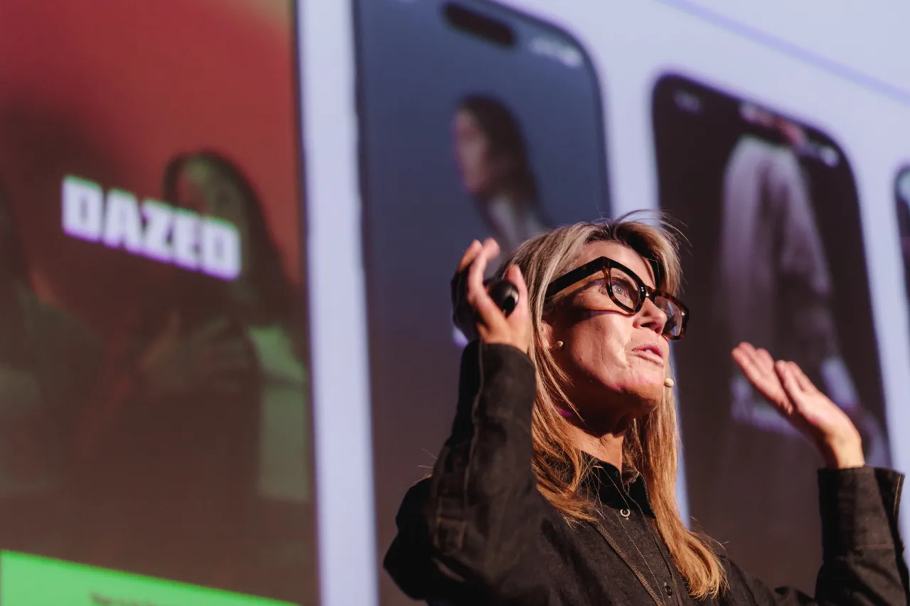
All Flows 2026: Your Best Work Has Personal Stakes
Creative Boom's recap of All Flows 2026 — published yesterday, May 26 — distilled the entire conference into one sentence: "the best creative conversations happen when the stakes are personal." Across multiple sessions, speakers returned again and again to the idea that work made from lived experience — not just technical skill — is the work that actually moves people and builds careers.
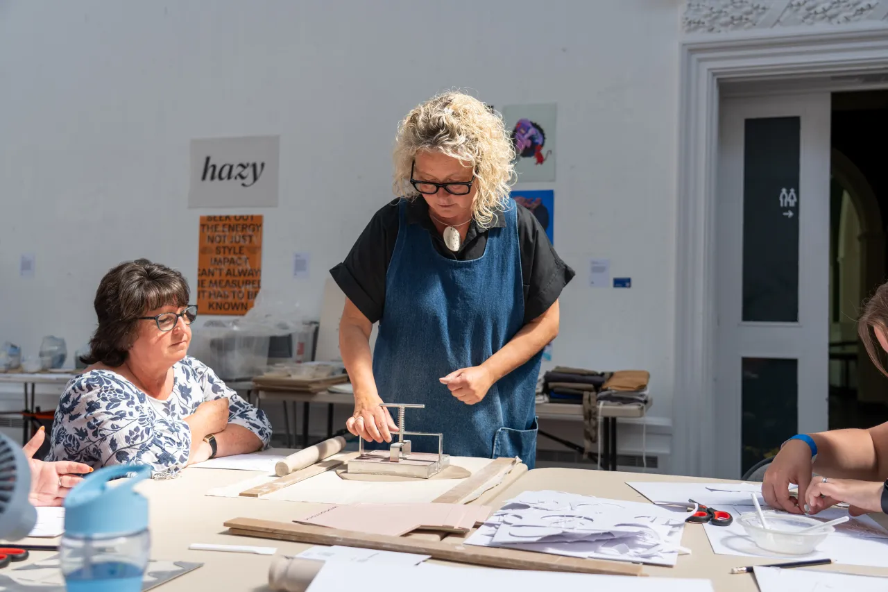
Northern Design Festival Designed Its Own Typeface
The Northern Design Festival (NDF), returning to Lancaster this May for its third year under the theme of Heritage, unveiled a bespoke custom typeface called Lancer. The font fuses traditional Blackletter letterforms — the angular, thick-stroked script of medieval manuscripts — with a geometric, contemporary skeleton. The NDF team described it as "a love letter to both the city and the wider creative community" and "freedom and independence in a single glyph."
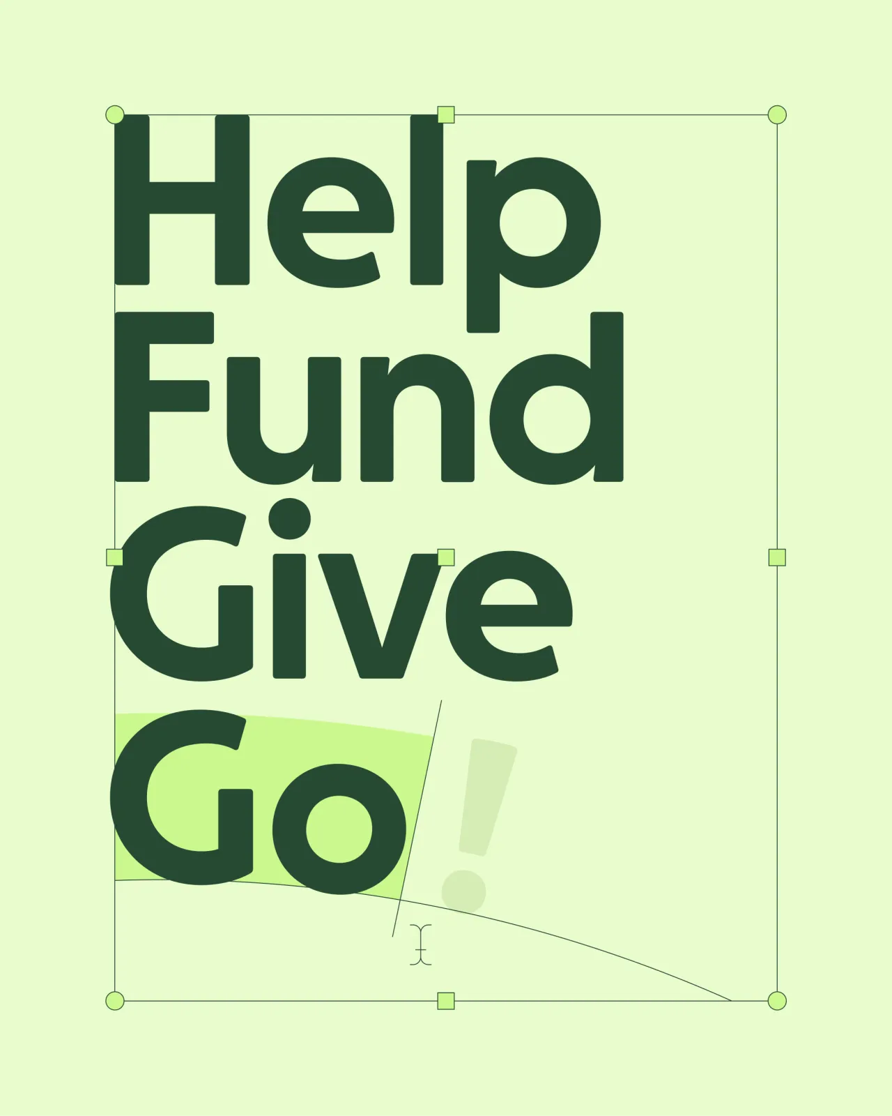
Koto Evolves GoFundMe Into a Platform With Bigger Ambitions
London/NYC studio Koto — whose brand systems work has appeared across global tech companies — just published its evolution of GoFundMe's visual identity, covered this week on Creative Boom. GoFundMe is expanding beyond individual fundraising into community-driven giving at scale, and the old identity couldn't stretch that far. Koto's solution retains brand recognition while softening, scaling, and systematizing the identity for a platform with a wider mission.
You’re done for today!
5 stories · under 10 minutes. See you tomorrow.
TODAY’S THREADFive stories. One current underneath all of them: the designer who thrives in 2026 knows exactly when to use the tool and when to put it down. Figma's May update removes friction. But every other story today — the Lancer typeface drawn from medieval history, GoFundMe rebuilt for a bigger mission, the deliberate choice to work with grain and imperfection, the All Flows reminder that personal stakes are what make work land — is about what happens after the software. Tools lower the floor. Your perspective raises the ceiling. *INNOVAT-NEWS | 27 May 2026 | 5 stories · under 10 minutes*