Figma Launches AI-Powered "Make Design" Overhaul
Figma has rolled out a significant upgrade to its AI-powered Make Design feature, allowing designers to generate multi-screen UI flows from plain-text prompts directly inside their existing files. The update introduces contextual awareness, meaning the AI reads your existing components and style guide before generating new frames — reducing the generic output problem that plagued earlier versions. Early community posts on the Figma Forum show teams cutting first-draft wireframe time by roughly half.

Adobe Shares the "Constraint Canvas" Rapid Ideation Method
Adobe's blog published a practitioner breakdown of a method called the Constraint Canvas, contributed by senior designers who use it in their Creative Residency program. The technique gives you a single sheet divided into four quadrants — Audience, Medium, Emotion, and Forbidden Element — and forces you to generate 10 concepts only after all four boxes are filled. The key rule: the Forbidden Element (something you're not allowed to use, e.g., no typography, no photography, no gradients) must be decided before ideation begins.
Jessica Walsh on Designing Work That Feels Dangerous
In a new editorial feature on It's Nice That published this week, Jessica Walsh — Creative Director and founder of &Walsh, with over 800,000 Instagram followers — spoke about her studio's approach to "uncomfortable beauty": deliberately choosing visual directions that make clients nervous in the first presentation. She argues that if a client immediately loves the first concept, the design hasn't pushed far enough, and she teaches her team to always prepare one direction that feels "slightly too far." The piece also touches on how she mentors young designers to separate personal taste from strategic boldness.

D&AD New Blood Awards: Final Entry Window Open Now
D&AD New Blood Awards — the most recognized global competition for student and emerging creative talent under 25 — has its final submission window active, with briefs from real industry partners including major agencies and brands across graphic design, branding, advertising, UX, and motion. Entry is open to students and recent graduates, and a New Blood Pencil is one of the most career-accelerating credentials a young designer can hold, regularly leading to agency internships and job offers directly through the awards platform.
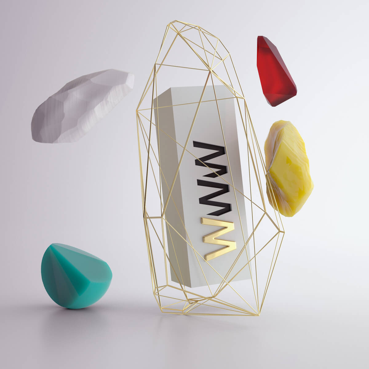
Awwwards Spotlights the "Invisible Grid" Micro-Trend
Awwwards published a curated round-up this week highlighting a rising micro-trend in award-winning web and interface design called the Invisible Grid — layouts that feel deliberately asymmetric and free-form to the viewer but are actually governed by a precise underlying mathematical structure (often a 24-column or modular baseline grid). The sites featured use this tension between apparent chaos and hidden order to create a sense of handcrafted energy with professional precision. Several of the highlighted studios are run by designers aged 22–27.
You’re done for today!
5 stories · under 10 minutes. See you tomorrow.
TODAY’S THREADEvery story today points at the same truth: **structure is what makes freedom feel intentional.** Figma's AI works because it respects your design system. The Constraint Canvas works because rules precede the ideas. Walsh's "dangerous" directions work because strategic thinking underpins the boldness. D&AD rewards work that answers a real brief, not just beautiful experiments. And the Invisible Grid proves that apparent chaos is disciplined chaos. The designers who will define the next decade aren't the ones who ignore structure — they're the ones who understand it deeply enough to know exactly when and how to break it.