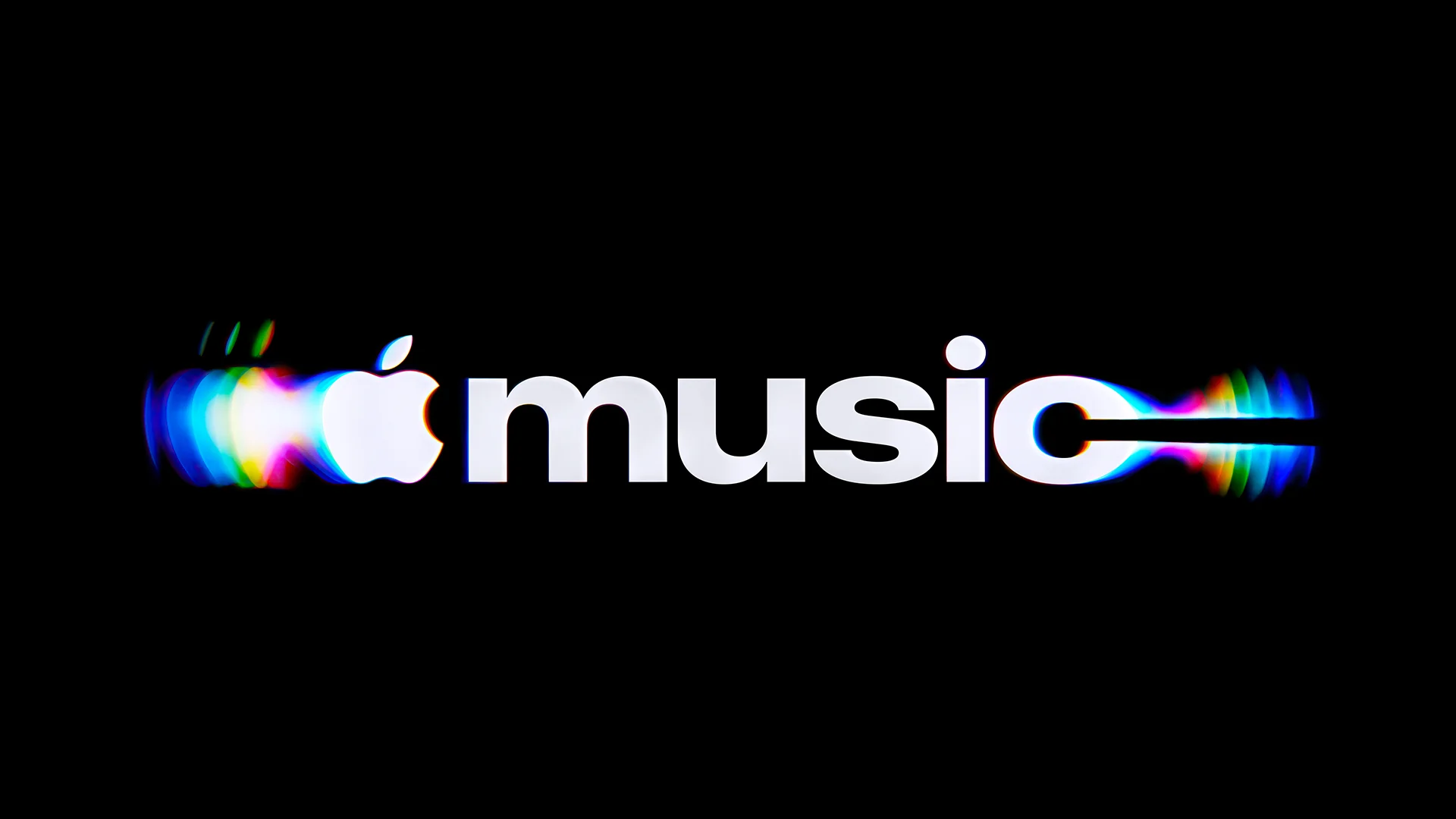
Apple Music's Sound-Born Logo: Design Meets Acoustics
Apple Music just dropped a rebrand built literally from sound. The new visual identity—wordmark, sonic logo, and rippling language system—was created by Apple Music's team, TBWA\Media Arts Lab, music producer Fred again.., and acoustic specialists Nest Acoustics. Sound waves shaped the visual design itself.
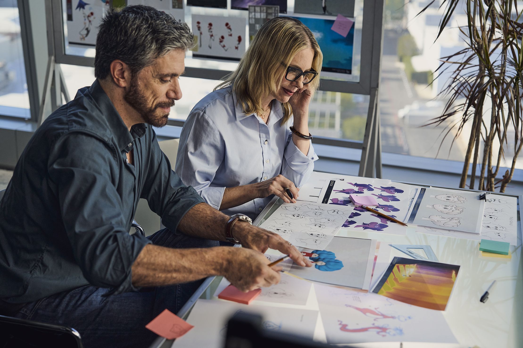
How Netflix's *The Cat in the Hat* Came Together in Two Years
Autodesk's new "Made to Make" series pulls back the curtain on Warner's animated adaptation of *The Cat in the Hat*, showing the tools and workflows that brought a feature film to life in just two years. Real studios, real timelines, real software in action.
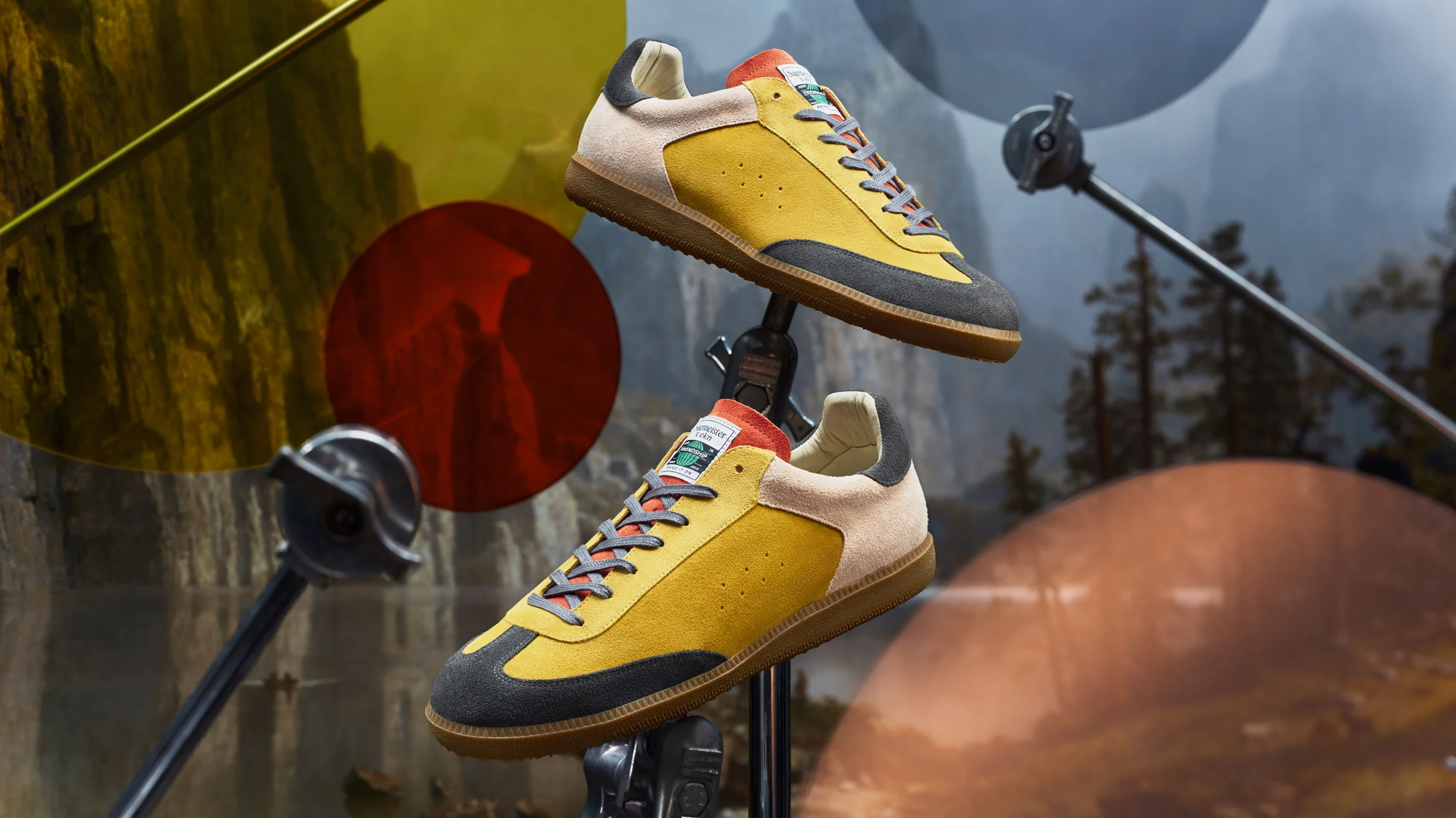
Stefan Sagmeister's Data Shoes: Infographics You Wear
Graphic designer Stefan Sagmeister designed two shoes for German brand Ekn that turn data visualization into wearable objects. Charts, statistics, and numbers become functional conversation starters you can literally walk in. The shoes are on view at his *Finally, Something Good* exhibition in Paris.

Sekondo: AI Inside Your Adobe Apps
Designer Jose Manuel Fernández launched Sekondo, a plugin that embeds ChatGPT and Claude directly into six Adobe apps (After Effects, Premiere Pro, Photoshop, Illustrator, InDesign, Lightroom Classic). Instead of generating new media, it works inside your existing project—you describe what you need, and AI helps you edit your own work.
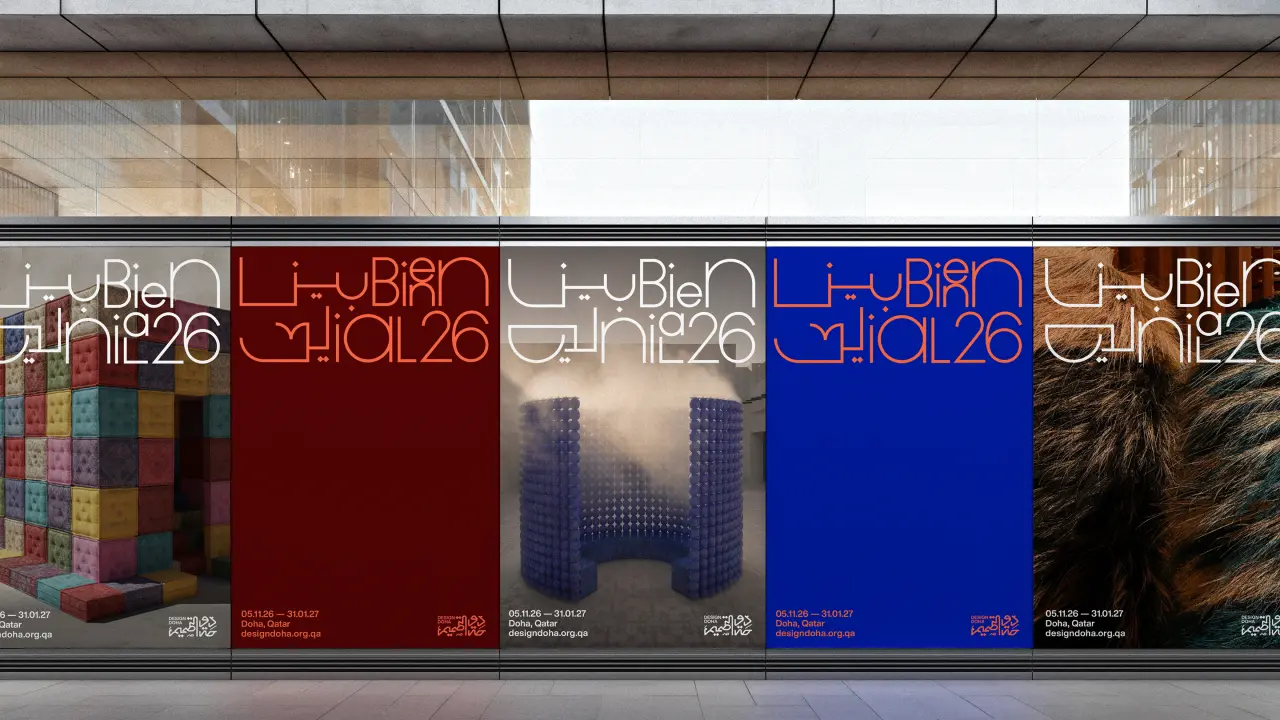
Design a Bilingual Visual System Without Favoring Either Language
Pentagram designer Samar Maakaroun created the identity for Design Doha Biennial 2026, solving a real challenge: how do you give Arabic and English equal visual weight when they read in opposite directions and have different letterforms? Her solution uses stretching letterforms to create a system where both languages connect.
You’re done for today!
5 stories · under 10 minutes. See you tomorrow.
TODAY’S THREADThe strongest design work this week moves *beyond the screen*—whether it's sound shaping a logo, data becoming shoes, AI embedding itself in your existing tools, or two languages dancing together in one system. The lesson: constraints and cross-disciplinary thinking create depth. Your best work won't live in isolation.